Empire State Building
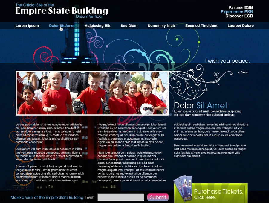
Digital Redesign & Concepts
Role: Lead Digital Strategist, UX Designer & Art Director
Core Deliverables: Global E-Commerce Web Platform, Design System, Brand Guidelines
Executive Summary
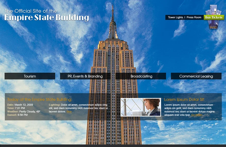
Led the end-to-end digital redesign and brand evolution for the Empire State Building’s web ecosystem to serve three core audiences:
- Global Observatory Tourists: Direct, high-conversion ticket sales engine (multi-currency/language).
- NYC Visitors: Comprehensive tourist package, interactive exhibit guide, and event directory.
- Commercial Tenants: Direct B2B portal for corporate leasing and business inquiries.
The Problem vs. Solution
| Legacy Issues | Redesign Solutions |
|---|---|
| Fragmented Journeys: B2C tourism and B2B commercial content competed for attention. | Segmented IA: Dedicated user paths for Observatory Visitors, Tourists, and B2B Tenants. |
| High Ticket Drop-Off: Complex, friction-heavy purchasing flow for global users. | Streamlined Funnel: Frictionless 3-step ticket checkout with clear ticket tier comparisons. |
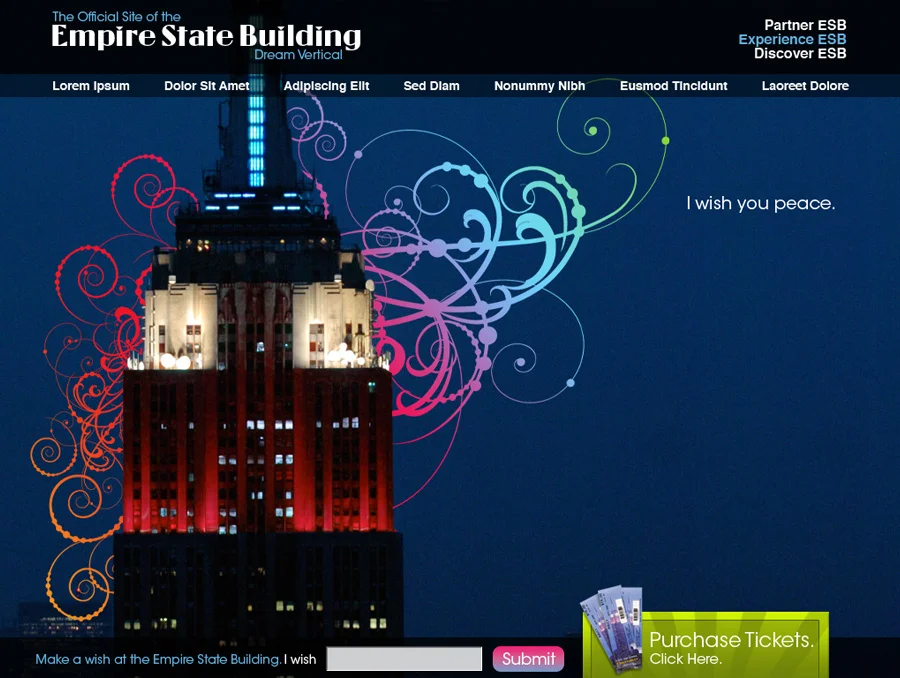
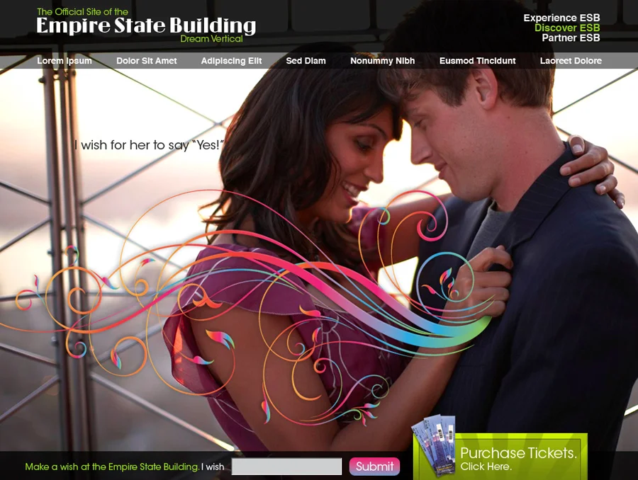
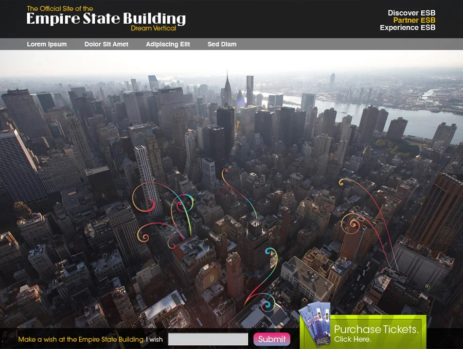
| Brand Dilution: Inconsistent visual elements and unstandardized layouts across sub-pages. | Unified Design System: Modernized Art Deco design language with reusable UI components. |
Key Initiatives & Strategic Impact
A. Global E-Commerce Hub
- Simplified checkout for Standard, Express, Sunset, and VIP packages.
- On-site mobile optimization for instant ticket access, live wait times, and audio tours.
B. Destination & Experience Guide
- Interactive exhibit previews, dining highlights, and curated NYC tourist bundles.
- Content strategy tailored for international travel planning.
C. Modular Design System & Art Direction
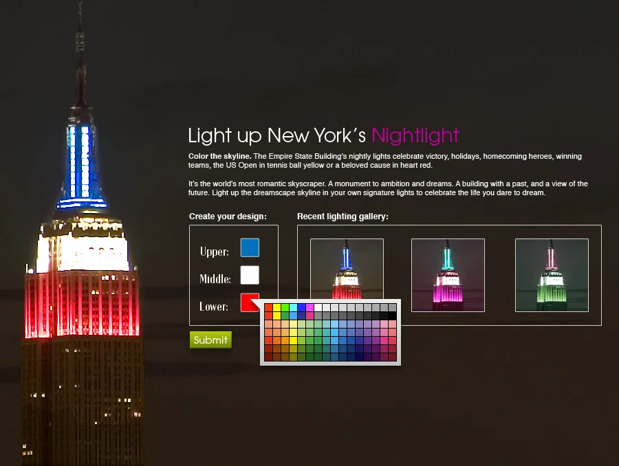
- Visual Identity: Elevated typography and sleek layouts paired with classic Art Deco heritage.
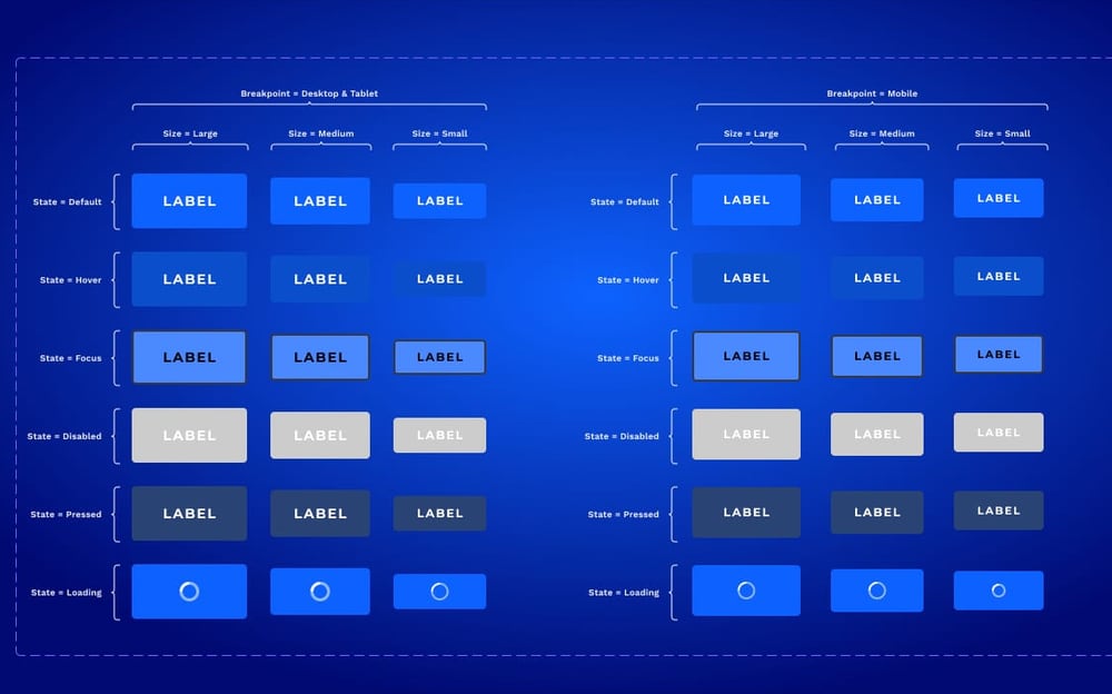
- UI Kit: Scalable design system including grid structures, accessible color palettes, and component guidelines for future iterations.
Deliverables Summary
- Strategy: User personas, conversion flows, and IA architecture map.
- UX/UI: Interactive prototypes, wireframes, and multi-iteration UI designs.
- Art Direction: Brand guidelines, design system documentation, and image direction.
Key Outcomes
- Unified Digital Platform: Seamlessly balanced heavy B2C tourism traffic with high-value B2B leasing leads.
- Scalable Framework: Established design guidelines that accelerated future sub-brand and mobile features.